9 Effective Usages of Color in Branding
Good color selection can change your brand marketing effectiveness.
It is often the goal of companies to make sure their customers understand what they stand for or what they are about. And there are a lot of ways to convey a brands vision, goal, or core principle. It can be expressed outright, printed on posters at their offices, displayed at the about section of their websites, or perhaps integrated on their design. The most successful at achieving this goal are the ones who know how to utilize a proper design, because after all, people are visual, and they usually gravitate towards brands that are visually aesthetic. And one important aspect of a good design is the effective use of colors. Colors convey and elicit emotions, they also add layers to the visual aesthetic of a brand.
But it is not just about choosing the right colors for your brand. An effective way of using colors for brand recognition is by utilizing the color palettes not just in the brand’s logo, it should be properly integrated on their websites, store fronts, products, promotional materials, and even staff uniforms.
With this, we look into 9 brands and their effective use of their colors to convey what their brand is all about.
- Lufthansa: Like most airlines, Lufthansa uses blue which represents the sky, but their effective use of Maastricht blue signifies reliability, clarity, and value which makes their use of yellow accents give a good contrast to show brightness, optimism, and exclusivity.
https://www.lufthansa.com

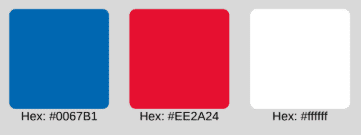
- Bank of America: The use of blue in banking institutions is common as it denotes trustworthiness, dignity and authority. Pair that with a good use of red to show strength, power, and being straightforward. Bank of America utilizes the American colors of red, white, and blue well on their website.
https://www.bankofamerica.com

- Airbnb: Airbnb’s use of Sunset Orange gives a sense of softness and hominess while at the same time giving a sense of passion. The use of teal gives a cool contrast which is easy on the eye and gives a sense of rest and relaxation.
https://www.airbnb.com

- Cadbury: Purple and Gold on their own already gives a sense of luxury, combined it gives a sense of royalty. Cadbury’s use of these colors gives the idea that their product is rich and premium. Purple also gives a sense of magic and playfulness which sits well with the brand.
https://www.cadbury.co.uk/

- Amazon: Orange denotes impulse, activity, and action, which serves Amazon well as their brand relies heavily on their customers need or impulse to buy. The color is utilized well on their brand and UI which customers can identify with so well.
;” https://www.amazon.com

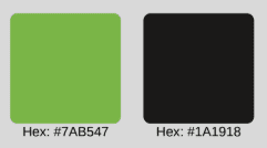
- Nvidia: A lot of tech companies rely on the use of green for their products or services as it represents freshness of ideas, innovation, creative solutions, and forward thinking. Afterall, green does mean go, so it also imbues positive action and growth. Nvidia use of green in contrast with black gives a striking impact that their company is about positive and forward solutions.

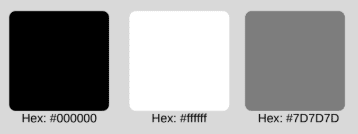
- Apple: Though Apple have utilized a spectrum of colors throughout their brands history, their proper use of gray, black, and white is still what gives them the premium feel. Black usually gives a notion of strength and confidence. Partnered with the softness of white and neutrality of gray, the color palette gives a sense of sophistication and luxury while appearing clean and straightforward.
https://www.apple.com/

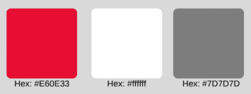
- Chick-Fil-A: Red. One of the most used colors in marketing, and for good measure, as it easily captures the attention of the customer. Red is also said to thirst the appetite that is why it is commonly used by food products. Such is the case for Chick-Fil-A. Their website contrasts red with white which is a classic approach for branding, but their use of red and white shows balance as the red is mainly just an accent on the website to make their products pop out in the white background.
https://www.chick-fil-a.com/

- Lego: The color wheel. Lego effectively uses the color wheel to showcase the diversity of their product. Being a toy line, they effectively catch the attention of customers by playing with all the colors available to their line. This ispresented on their website with a clean UI and with white being the background, the products pop out easily and the website is easy on the eye despite the plethora of colors used.
https://www.lego.com/en-us

No Comments